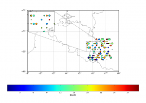
Here, we will focus on adding a “zoom box” on the top left corner of the plot. But before that, we will mask a part of the earthquakes, in order to have a “cleaner” map !
This is achieved by using the numpy.ma module :
import numpy.ma as ma
Mlon = ma.masked_outside(lon, 5.6, 7.5) # creates an array with "False" values for lon values outside the range [5.6,7.5], "True" inside
Mlat = ma.masked_outside(lat,49.6,50.6) # idem, but for lat outside [49.6,50.6]
lat = ma.array(lat,mask=Mlon.mask+Mlat.mask).compressed() # applying the sum of the two masks (True/False) to the lat array AND compression of the array (removes the masked values)
lon = ma.array(lon,mask=Mlon.mask+Mlat.mask).compressed() # idem
depth =ma.array(depth,mask=Mlon.mask+Mlat.mask).compressed() # idem
magnitude = ma.array(magnitude,mask=Mlon.mask+Mlat.mask).compressed() # idem
# at this stage, lat, lon, depth and magnitude arrays have the same length (shape)
In this snippet, we build a masked array called Mlon that rejects all values outside [5.6,7.5], and a Mlat that rejects all values outside [49.6,50.6]. Then, we apply both masks to the lat, lon, depth and magnitude arrays in order to have 4 arrays having the same shape.
Then, the zoom : We need to define new axes using mpl_toolkits.axes_grid :
from mpl_toolkits.axes_grid.inset_locator import zoomed_inset_axes
from mpl_toolkits.axes_grid.inset_locator import mark_inset
from mpl_toolkits.axes_grid.anchored_artists import AnchoredSizeBar
# we define the inset_axes, with a zoom of 2 and at location 2 (upper left corner)
axins = zoomed_inset_axes(ax, 2, loc=2)
m.scatter(x,y,s=10*magnitude,c=depth) # we redraw the scatter in this inset
x,y = m(5.5,50.0) # we define the corner 1
x2,y2 = m(6.5,50.5) # then corner 2
axins.set_xlim(x,x2) # and we apply the limits of the zoom plot to the inset axes
axins.set_ylim(y,y2) # idem
plt.xticks(visible=False) # we hide the ticks
plt.yticks(visible=False)
mark_inset(ax, axins, loc1=1, loc2=3, fc="none", ec="0.5") # we draw the "zoom effect" on the main map (ax), joining cornder 1 & 3

# Then, I wanted to have a scale on the zoom plot :
asb =  AnchoredSizeBar(axins.transData,
                          10000., # length of the bar in the data reference
                          "10 km", # label of the bar
                          loc=4, # location (lower right)
                          pad=0.1, borderpad=0.25, sep=5,
                          frameon=False)
axins.add_artist(asb) # and finaly, we add the scale to the inset axis
See the full code after the break ;
#
# BaseMap example by geophysique.be
# tutorial 03

from mpl_toolkits.basemap import Basemap
import matplotlib.pyplot as plt
import numpy as np

fig = plt.figure(figsize=(11.7,8.3))
#Custom adjust of the subplots
plt.subplots_adjust(left=0.05,right=0.95,top=0.90,bottom=0.05,wspace=0.15,hspace=0.05)
ax = plt.subplot(111)
#Let's create a basemap around Belgium
m = Basemap(resolution='i',projection='merc', llcrnrlat=49.0,urcrnrlat=52.0,llcrnrlon=1.,urcrnrlon=8.0,lat_ts=51.0)
m.drawcountries(linewidth=0.5)
m.drawcoastlines(linewidth=0.5)

m.drawparallels(np.arange(49.,53.,1.),labels=[1,0,0,0],color='black',dashes=[1,0],labelstyle='+/-',linewidth=0.2) # draw parallels
m.drawmeridians(np.arange(1.,9.,1.),labels=[0,0,0,1],color='black',dashes=[1,0],labelstyle='+/-',linewidth=0.2) # draw meridians

# Let's add some earthquakes (fake here) :

lon = np.random.random_integers(11,79,1000)/10.
lat = np.random.random_integers(491,519,1000)/10.
depth = np.random.random_integers(0,300,1000)/10.
magnitude = np.random.random_integers(0,100,1000)/10.

# I'm masking the earthquakes present in most of the regions (illustration of masks usage) :
import numpy.ma as ma
Mlon = ma.masked_outside(lon, 5.6, 7.5)
Mlat = ma.masked_outside(lat,49.6,50.6)
lat = ma.array(lat,mask=Mlon.mask+Mlat.mask).compressed()
lon = ma.array(lon,mask=Mlon.mask+Mlat.mask).compressed()
depth =ma.array(depth,mask=Mlon.mask+Mlat.mask).compressed()
magnitude = ma.array(magnitude,mask=Mlon.mask+Mlat.mask).compressed()

x,y = m(lon,lat)
m.scatter(x,y,s=10*magnitude,c=depth)
c = plt.colorbar(orientation='horizontal')
c.set_label("Depth")

# adding a zoom plot :
from mpl_toolkits.axes_grid.inset_locator import zoomed_inset_axes
from mpl_toolkits.axes_grid.inset_locator import mark_inset
from mpl_toolkits.axes_grid.anchored_artists import AnchoredSizeBar

axins = zoomed_inset_axes(ax, 2, loc=2) # zoom = 4
m.scatter(x,y,s=10*magnitude,c=depth)
x,y = m(5.5,50.0)
x2,y2 = m(6.5,50.5)
axins.set_xlim(x,x2)
axins.set_ylim(y,y2)
plt.xticks(visible=False)
plt.yticks(visible=False)
mark_inset(ax, axins, loc1=1, loc2=3, fc="none", ec="0.5")
asb = AnchoredSizeBar(axins.transData,
 10000.,
 "10 km",
 loc=4,
 pad=0.1, borderpad=0.25, sep=5,
 frameon=False)
axins.add_artist(asb)

plt.show()


Great tutorial of the mpl_toolkits.axes_grid toolkit!
I am currently working with basemap and matplotlib and maybe you could help me a bit… I am trying to draw multiple pie charts on an existing map at given coordinates. However the pie function plots the result on a new graph… I have tried the axes_grid toolkit but new axes are greated using relative coordinates of the existing graph and I am looking for absolute ones…
Thanks in advance, Gui
Hi Gui,
Thanks for the comment !
I think, the best way to do this is not using axes_grid, but rather to plot the “artists” that represent your pie chart. Without checking the documentation (Yes, I know, it’s baaaaaaaad), I think a pie chart is a group of polygons arranged together. I *think* all matplotlib “plots” are bound to “artists”, so, if you can get your hands inside the code behind the pie chart, you should be able to use the plt.add_artist() method (matplotlib.pyplot is plt). If the pie chart is a “collection”, then plt.add_collection could do … The thing to remember when playing with basemap, is that : 1° you have to properly project your pie-position m(x,y) in the basemap projection ; 2° the size variable should be set accordingly : if, for example, using a transverse mercator projection, size=200 would mean 200 meters for the chart, which, if you have a 10 by 10 degree window, will never appear larger than a single point.
I would suggest to :
1° check the piechart api, look for artist or collection
2° test on a normal matplotlib figure using X, Y coordinates
3° switch the working step 2 to basemap !!
Tell me if this helps, and if you succeed, I’ll be pleased to let you post the news on this website !
Gui,
In fact, I wasn’t far from the solution, check
http://matplotlib.sourceforge.net/examples/api/scatter_piecharts.html?highlight=pie
You’ll see how they manage to draw a pie charts as if it was a scatter !! It should be fairly easy to transpose (*or project*) to basemap !!
But this is a hack, I’m pretty sure handling the (patches, texts, autotexts) that pylot.pie returns is a far better solution !
Thanks a lot for your help Thomas…
This hack will provide a quick and first work-around to my problem. I went (too) quickly through the example gallery and didn’t notice it.
I will also dig your hint about using artist behind the pie chart.
I would be glad to post the solutions on your blog : there are too few examples using together basemap, matplotlib and numpy.
Thanks again , gui
Note that the scalebar is wrong due to a matplotlib bug: https://github.com/matplotlib/basemap/issues/165