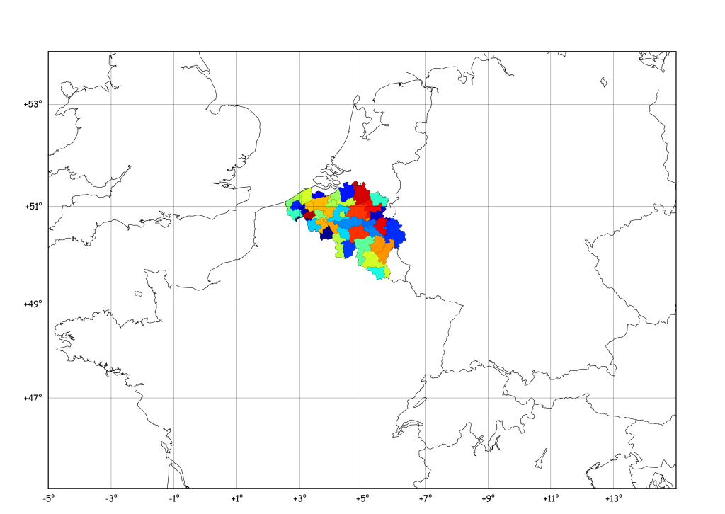
Old 16bit DOS programs on Windows 7 (x64)

We needed to execute an old-but-working 16bits program to locate earthquakes called “HypoEllipse” (source), but calling it from the Windows 7 x64 boxes resulted in a nice :

16bits

Bam ! Not working, sorry for you…

No ! I say No ! Some great guys developed “DosBOX”:

dosbox

a super emulator for old-but-working DOS applications ! All you have is to download and install the application from their sourceforge.net.and configure it :-)

Say, my hypoel.exe porgram is located in the folder “C:\Users\thomas\Desktop\hypo”, to ease my work, I’ll add this path to the startup of the DosBOX. To do that, go to the installation folder (C:\Program Files (x86)\DOSBox-0.74) and execute DOSBox 0.74 Options.bat. The end of the content of the ini file defines the [autoexec] part:

[autoexec]
# Lines in this section will be run at startup.
# You can put your MOUNT lines here.

Replace with those lines:

[autoexec]
# Lines in this section will be run at startup.
# You can put your MOUNT lines here.

keyb be
mount h c:/Users/thomas/Desktop/hypo

At startup, the [autoexec] will be executed: keyb be will define the keyboard layout to Belgian French and the mount instruction will mount the path to hypo to drive letter h:.

Then, open DOSbox, and, once loaded, type h: to change directory to the hypo folder:

dosbox1

The old dir command will list the content of the folder :

dosbox2

to increase the velocity of the emulator, you can hit CTRL-F12 several times (visible in the output console of the emulator):

dosbox3

That’s all, folkes !

Meteor in Russia – Seismic Signal ?

Very early this morning, a meteor lit up the skies of Russia, somewhere close to Ekaterinburg.

meteor

Same as for the Korean Boom Boom, we wanted to have a look at the seismic data of a close-by station to check if something was visible. The closest IRIS seismic station to this place is II.ARU (see location), at a distance of roughly 135 km.

ekat

One BHZ component is available on an STS-1 seismometer.To know the timestamp of the “event”, i took a guess that the overlay on the video was correct, and once corrected for the timezone, gave 03:26 UTC. Then, the easy part, getting data from IRIS :

from obspy.iris import Client
comp ="BHZ"
client = Client()
t1 = UTCDateTime("2013-02-15 03:00:00")
st = client.getWaveform("II", "ARU", "00", comp, t1 , t1 + 3600)

one gets:

figure_0

or, high-pass filtered above 1 Hz:

figure_1

There are two clear signals at 23 min and 38 min, but I have *no* idea if those are related to the meteor, its sonic boom(s), a potential impact with the ground, any-thing! If you have ideas, please share in the comments section below !

Finally, two close-ups of the higher amplitude stuff:

figure_3 figure_4

EDIT:

A M5.7 earthquake occurred in Tonga at 03:02:21.1, using obspy’s implementation of TauP, I get:

from obspy.taup.taup import getTravelTimes
from obspy.core import UTCDateTime
import pyproj
slat =56.43
slon =58.56

t0 = UTCDateTime("2013-02-15 03:02:21.1")
elat = -19.77
elon = 174.07
edep = 77

gc = pyproj.Geod(ellps='WGS84')
az1,az2,d2 = gc.inv(elon,elat,slon,slat)
km2deg = 40075.016686 / 360. #This is WGS84 norm
d = d2/(km2deg*1e3)
distance_units="deg"
tt = getTravelTimes(d, edep, model='ak135')
if tt:
    for tti in tt:
        print tti['phase_name'],t0+tti['time']

arrival times:

     Pdiff 2013-02-15T03:17:27.424402Z
    pPdiff 2013-02-15T03:17:48.467493Z
    sPdiff 2013-02-15T03:17:56.730005Z
     PKPdf 2013-02-15T03:21:03.121484Z
     PKiKP 2013-02-15T03:21:03.211206Z
    pPKPdf 2013-02-15T03:21:24.910425Z
    pPKiKP 2013-02-15T03:21:24.993921Z
    sPKPdf 2013-02-15T03:21:33.009302Z
    sPKiKP 2013-02-15T03:21:33.094141Z
        PP 2013-02-15T03:22:29.301294Z
     SKPdf 2013-02-15T03:24:31.683740Z
     SKiKP 2013-02-15T03:24:32.054101Z
     PKSdf 2013-02-15T03:24:39.782373Z
     SKSac 2013-02-15T03:27:53.448022Z
     SKSdf 2013-02-15T03:28:08.284570Z
    pSKSac 2013-02-15T03:28:23.035425Z
    sSKSac 2013-02-15T03:28:31.218286Z
    pSKSdf 2013-02-15T03:28:38.175683Z
    sSKSdf 2013-02-15T03:28:46.273706Z
    SKKSac 2013-02-15T03:29:22.002222Z
     Sdiff 2013-02-15T03:30:14.318506Z
    pSdiff 2013-02-15T03:30:41.697168Z
    sSdiff 2013-02-15T03:30:50.556787Z
    PKKPbc 2013-02-15T03:31:10.561548Z
    PKKPab 2013-02-15T03:31:12.351709Z
    PKKPdf 2013-02-15T03:31:42.770532Z
        SP 2013-02-15T03:32:11.134790Z
        PS 2013-02-15T03:32:20.137964Z
    SKKPbc 2013-02-15T03:34:51.262353Z
    PKKSbc 2013-02-15T03:34:59.426904Z
    SKKPdf 2013-02-15T03:35:11.194726Z
    PKKSdf 2013-02-15T03:35:19.292139Z
    SKKSac 2013-02-15T03:38:36.127588Z
    SKKSdf 2013-02-15T03:38:47.644678Z
        SS 2013-02-15T03:38:50.680566Z
    P'P'df 2013-02-15T03:39:54.882959Z
    S'S'ac 2013-02-15T03:53:42.594873Z
    S'S'df 2013-02-15T03:54:13.323633Z

and, plotting those:

tonga

doesn’t explain all the peaks visible… Ideas, guys ?


Plot waveforms of events on a dates axis

Following a question from my dear colleague Devy, here is how to plot a set of events, occurring at random moments in time. The idea is to plot the waveform of each event with the beginning at the top and the end at the bottom (along the “y” axis) and centred on the origin time of the event (x axis is thus a datetime axis). To illustrate the example, let’s get a decreasing sinusoid :

import numpy as np
import matplotlib.pyplot as plt

f = 10
t  = np.linspace(0,1.,1000)
y = np.sin(t*2*np.pi*f) * np.exp(-t)**2

plt.plot(t,y)
plt.show()

one

then, flip it and convert the y data to a time-aware amplitude:

import datetime
t0 = datetime.datetime.now()
yd = [t0 + datetime.timedelta(days=yi) for yi in y]
plt.plot(yd,-t)
plt.ylim(-t[-1]-1,0)
plt.show()

two

and finally, get 100 of those, irregularly placed in time:

for i in np.random.randint(0,100,100)*np.random.random(100):
    t0 = datetime.datetime.now() + + datetime.timedelta(days=i)
    yd = [t0 + datetime.timedelta(days=yi) for yi in y]
    plt.plot(yd,-t)

plt.ylim(-t[-1]*1.1,0)
plt.show()

three

Voilàààà, happy coding, Dev’ !

import numpy as np
import matplotlib.pyplot as plt

f = 10
t  = np.linspace(0,1.,1000)
y = np.sin(t*2*np.pi*f) * np.exp(-t)**2

plt.plot(t,y)
plt.show()

import datetime
t0 = datetime.datetime.now()
yd = [t0 + datetime.timedelta(days=yi) for yi in y]
plt.plot(yd,-t)
plt.ylim(-t[-1]-1,0)
plt.show()

for i in np.random.randint(0,100,100)*np.random.random(100):
    t0 = datetime.datetime.now() + + datetime.timedelta(days=i)
    yd = [t0 + datetime.timedelta(days=yi) for yi in y]
    plt.plot(yd,-t)

plt.ylim(-t[-1]*1.1,0)
plt.show()

The full code is after the break:

Continue reading

North Korean nuclear tests with Obspy

This morning, North Korea tested some nuclear “bomb” somewhere in the middle of the country (confirmed by Pyongyang officials and CTBTO), and many seismic sensors worldwide recorded the triggered waveforms. The location of the test is the same as the 2009 one, confirmed by the location provided by global monitoring networks (USGS, GEOFON).

To pythonise this event, let’s get the data from the two explosions, using the obspy.iris module !

from obspy.core import UTCDateTime
from obspy.iris import Client
import matplotlib.pyplot as plt
import numpy as np

client = Client()
t1 = UTCDateTime("2013-02-12 02:57:51.2")
st = client.getWaveform("IC", "MDJ", "00", "BHZ", t1-30 , t1 + 300)
t2 = UTCDateTime("2009-05-25 00:54:43")
st2= client.getWaveform("IC", "MDJ", "00", "BHZ", t2-30 , t2 + 300)

d1 = st[0].data
d1 -= d1[0]
d2 = st2[0].data
d2 -= d2[0]
t = np.linspace(-30,300,len(d1))
plt.figure(figsize=(12,4))
plt.plot(t,d1,label=str(t1))
plt.plot(t,d2,label=str(t2))
plt.legend()
plt.title('Korean Boom Boom')
plt.grid()
plt.show()

Which will show:

koreanboomboom

Even my untrained eye can tell, dam’n, those two waveforms look crazy identical!

Footnote, I have no knowledge of nuclear bombs, the energy or typical waveforms related to them. I just, like many, read the news today, and plotted the waveforms of two confirmed tests together.

Seismicity Map and Rate using Basemap and Pandas

Imagine we want to plot a map of the seismic activity in NW-Europe and, at the same time, count the number events per month. To get a catalogue of earthquakes in the region, one can call the NEIC (note: this catalogue contains a lot of different stuff, i.e. quarry blasts, mining-induced events, army-directed WWI&II bombs explosions at sea, etc). Anyway, it’s a BIG dataset, big enough to justify an automated mapping & rate estimation script !

The goal:

Obtaining

event_map

event_rate

Process:

First, we’ll get the catalogue from NEIC, by calling their search page directly (not sure it’s the best way…):

request = """http://neic.usgs.gov/cgi-bin/epic/epic.cgi?
SEARCHMETHOD=2&FILEFORMAT=4&SEARCHRANGE=HH
&SLAT2=54&SLAT1=45&SLON1=-5&SLON2=15
&SYEAR=&SMONTH=&SDAY=&EYEAR=&EMONTH=&EDAY=
&LMAG=&UMAG=&NDEP1=&NDEP2=&IO1=&IO2=
&CLAT=0.0&CLON=0.0&CRAD=0.0&SUBMIT=Submit+Search"""

import urllib
u = urllib.urlopen(request)
lines = u.readlines()[34:-33]

events = [line.split()[1:9] for line in lines]

in this code, we get the data using urllib by passing a long request containing our zone of interest (defined in line 3 of the request). The output is then sliced to reject header and footer, then splitted into chunks containing the information of each event.

The map is drawn using:

ye,mo,d,t,lat,lon,dep,mag = zip(*events)
lon = np.array(lon,dtype='float')
lat = np.array(lat,dtype='float')
dep = np.array(dep,dtype='float')
x,y = m(lon,lat)
plt.scatter(x,y,c=dep,vmin=5,vmax=25)
cb = plt.colorbar()
cb.set_label('Depth (km)')
plt.show()

while the seismicity rate is computed and plotted using pandas:

dates = []
for yi, moi, di, ti in zip(ye,mo,d,t):
    date = "%04i-%02i-%02i %s" % (int(yi), int(moi), int(di),ti[0:6])
    date = datetime.datetime.strptime(date,'%Y-%m-%d %H%M%S')
    dates.append(date)

df = pd.DataFrame({"events":np.ones(len(dates))},index=dates)
rs = df.resample('1M',how='sum')
rs.plot()
plt.title('Seismicity Rate (using NEIC catalog...)')
plt.ylabel('Number of events')
plt.show()

In this case, we resample the index (= the dates) to 1 value per month. The resampling is done using how=”sum”, telling pandas to count the number of events (each event is a 1 in the DataFrame).

And… It’s done !

From a seismological point of view:

The apparent increase in rate from 1997 onwards could be related to either: a change in magnitude threshold sent by networks or agencies to the NEIC, a change in filtering of events (quarry blasts, etc), or a real rate increase. The drop after 2004 could have the same reasons, but in opposite direction. Those ideas will be treated in the next tutorials, stay tuned !

For sure, most of the earthquakes located in the centre of the Ardenne (SE Belgium) are mostly quarry blasts. We’ll show how to determine that in another tutorial, too !


The full code is after the break:

Continue reading